
Introduction to describing graphs and tables
A pie chart
In many subject areas you may need to refer to numbers, statistics and other data during the course of your studies. This is likely to be data collected by other people which you will use to support your written work, but it may be data that you have collected yourself as part of your studies. Data is generally presented in the form of tables, charts and graphs, which makes it easier for readers to understand. However, it is often necessary to reproduce and refer to this type of information in words, as part of a report or written assignment. If you include a graph, chart or table in your writing, you must explain very clearly what the data in it means, and why it is relevant to your report or assignment.
In the following activities you will consider how data should be presented within your writing, and you will examine and practise the language used to describe and refer to data in a graph. Much of the vocabulary is similar, whether you are referring to a graph, table or chart.
Activity 1: Understanding how to present a graph
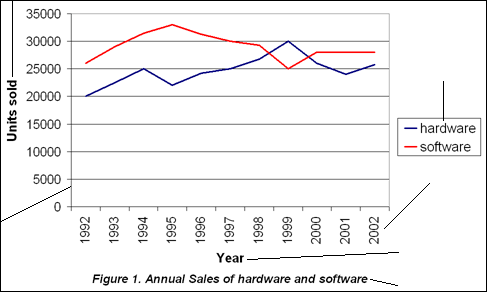
When you write a report or an assignment, it may be necessary to include some data, for example, in a graph. This data should be included within the body of your text. In this activity, you are going to consider how data, such as a graph, should be presented in your writing.

Instruction
Look at the example graph below. Can you correctly name the different parts of the graph? Drag and drop the items into place to give them their correct label. Then read the feedback.
Activity 2: Understanding information in a graph
In this activity, you are going to examine the graph from Activity 1 in more detail. It gives some information about an IT (Information Technology) company's hardware and software sales. You are then going to consider the meaning of the data it shows.

Instruction
Study the line graph and then read the statements below. Decide if they are true or false and select the appropriate button. Then read the feedback.
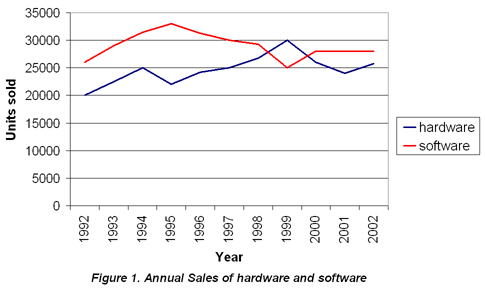
The graph shows annual sales of hardware and software over a period of ten years.
The horizontal axis on the graph shows the number of units sold.
The vertical axis shows the number of units sold and is measured in numbers which go up by 5000 at each level.
The graph only shows where sales have increased.
It would be fair to say that sales figures have gone up and down over the period described.
Activity 3: Describing a graph
Once you are confident that you understand the data described in a graph or table you are in a position to be able to write about it and refer to the data it contains.

Instruction
Read the following text, which describes the graph below. Select the words that are needed to complete the text from the dropdown lists. Then read the feedback.

The graph the sales figures for two products from 1992 to 2002. The axis represents years and the axis represents units sold. The graph presents both the and the in sales for both products, as sales during the ten-year period.
Activity 4: Writing about a graph
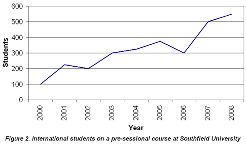
In this activity, you are going to study a graph showing data about international student numbers on a particular course at a UK university, and then practise writing a simple description of the data it shows.

Instruction
Study the graph below. Write a brief paragraph in the box describing the data shown in the graph. Then read the feedback.
© eLanguages, Modern Languages and Linguistics, University of Southampton, 2014. All rights reserved.

